Howard Marks published another Oaktree Capital memo recently, Ruminating on Asset Allocation, which included several insights about asset classes and how to create a portfolio. I recommend reading the entire thing, but here are a few highlights about how to better understand the balancing act that is asset allocation. (I know many people follow them, but I ignore all the memos that lean toward macroeconomic forecasts.)
Here are the top-level takeaways, which set the table:
- Fundamentally speaking, the only asset classes are ownership and debt.
- They differ enormously in terms of their fundamental nature.
- Ownership assets and debt assets should be combined to get your portfolio to the position on the risk/return continuum that’s right for you. This is the most important decision in portfolio management or asset allocation.
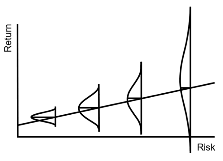
How do you pick the right relative amounts of equities (ownership of a business) and bonds (debt)? The top chart above adds a new dimension of probability to just “risk increases with return”, and is actually from a previous Howard Marks memo:
…we see that as the thing called “risk” increases (that is, as we move from left to right on the graph), not only does the expected return increase, but the range of possible outcomes becomes wider and the bad outcomes become worse. That’s risk! (I hope this way of presenting risk will be considered a lasting contribution to the investment industry when I’m gone.)
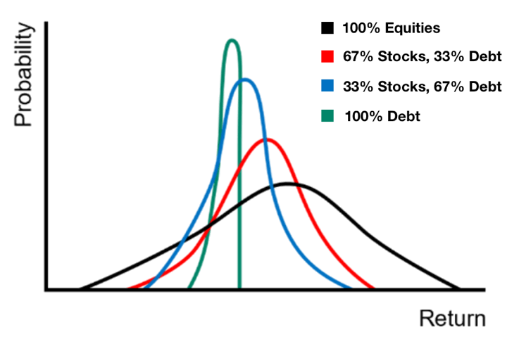
Below is a new chart that keeps with the theme of considering probability vs. return, but for different asset class mixes (I edited the chart to explain the colors directly).

Ownership assets typically have a higher expected return, greater upside potential, and greater downside risk. Everything else being equal, the expected returns from debt are lower but likely to fall within a much tighter range.
Again, as we move from left to right (more ownership assets, less debt), the expected return increases and the expected risk increases (that is, just as in Figure 6 [the first chart above], the range of possible outcomes grows wider and the left-hand tail stretches further into undesirable territory). This way of presenting the options might be more intuitively clear.
Someone who believes in “more risk, more return” as portrayed in Figure 5 should logically adopt a high-risk posture. But if they understand the real implications of increased risk, as suggested by Figures 6 and 7, then they might opt for something more moderate.
Hopefully, this visualization can help us investors understand the value in a “balanced” portfolio holding both stocks and bonds. I would point out this is based on a diversified portfolio of stocks and/or bonds. Single companies can of course fail, but so many people have also gotten burned with “safe” investments that ended up with a -100% return (complete loss).
[Side note: The Yotta/Synapse/Evolve drama continues… I actually found my lost pennies in the “anonymized” ledger (legal?!?), but you can also see that so many others lost really significant amounts of money on what was supposedly FDIC-insured deposits.]
“The editorial content here is not provided by any of the companies mentioned, and has not been reviewed, approved or otherwise endorsed by any of these entities. Opinions expressed here are the author’s alone. This email may contain links through which we are compensated when you click on or are approved for offers.”
Visualizing Asset Allocation Choices: Risk vs. Return vs. Probability from My Money Blog.
Copyright © 2004-2022 MyMoneyBlog.com. All Rights Reserved. Do not re-syndicate without permission.


