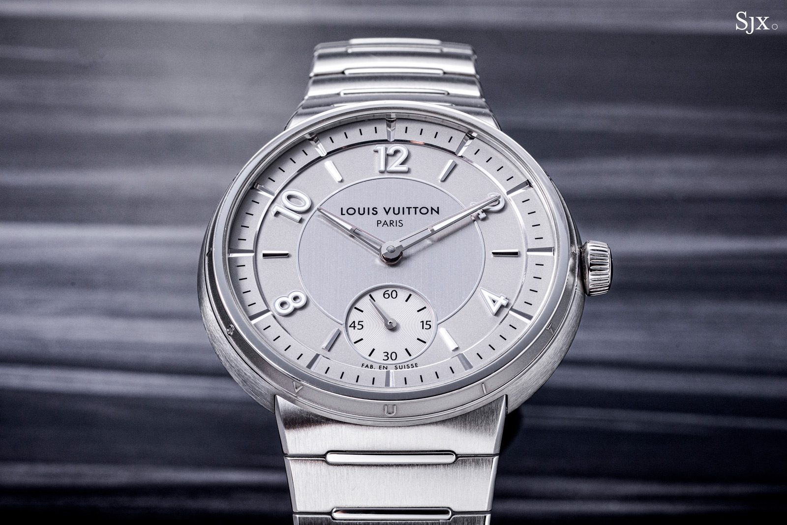
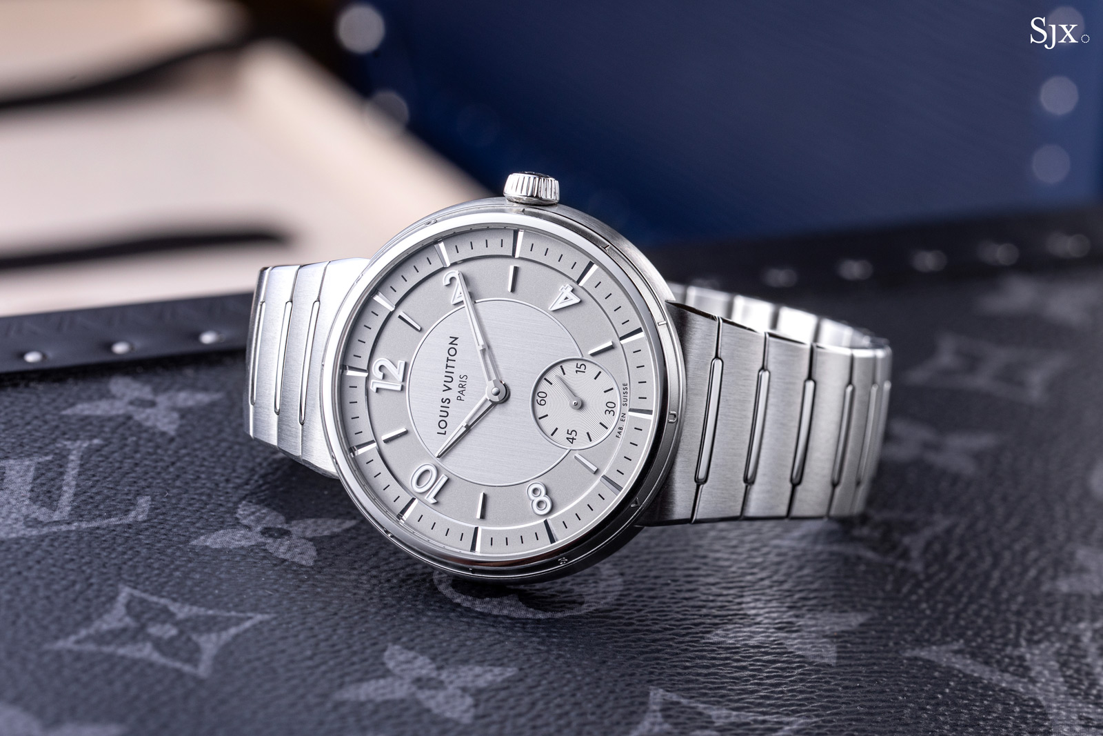
Louis Vuitton has redesigned its trademark wristwatch some two decades after it was introduced. In contrast to its predecessors, the Louis Vuitton Tambour has been refined and condensed into a thin, streamlined wristwatch that’s just 8.3 mm high.
Sporting a touch of 1970s style, the new Tambour is equipped with the LFT023, an automatic movement featuring a micro-rotor. Representing the first of a new generation of Louis Vuitton movements, the LFT023 was developed by movement maker Le Cercle des Horlogers and features novel details like frosted bridges with relief borders and clear jewels.

The new Tambour replaces all existing Tambour models, save for the high-end complications, like the automatons and minute repeaters, as well as the entry-level Street Diver. As a result, the once diverse and occasionally confusing offer of watches is rationalised to essentially three lines – Street Diver, the new Tambour, and complications.
Initial thoughts
Now 20 years old, the Tambour has been around long enough to become easily recognisable as Louis Vuitton’s trademark watch case. The original Tambour was an appealing design, particularly when paired with complications – I am personally a big fan of some complicated Tambour models – but it felt chunky even on a smaller scale.
So the new Tambour is everything that the original was not – svelte and restrained. On its face it is not as recognisable as the original, but in profile it is clearly evolved from the original. The sloping sides of the case still read “LOUIS VUITTON”, but in a font that’s small enough to be concealed at a distance.
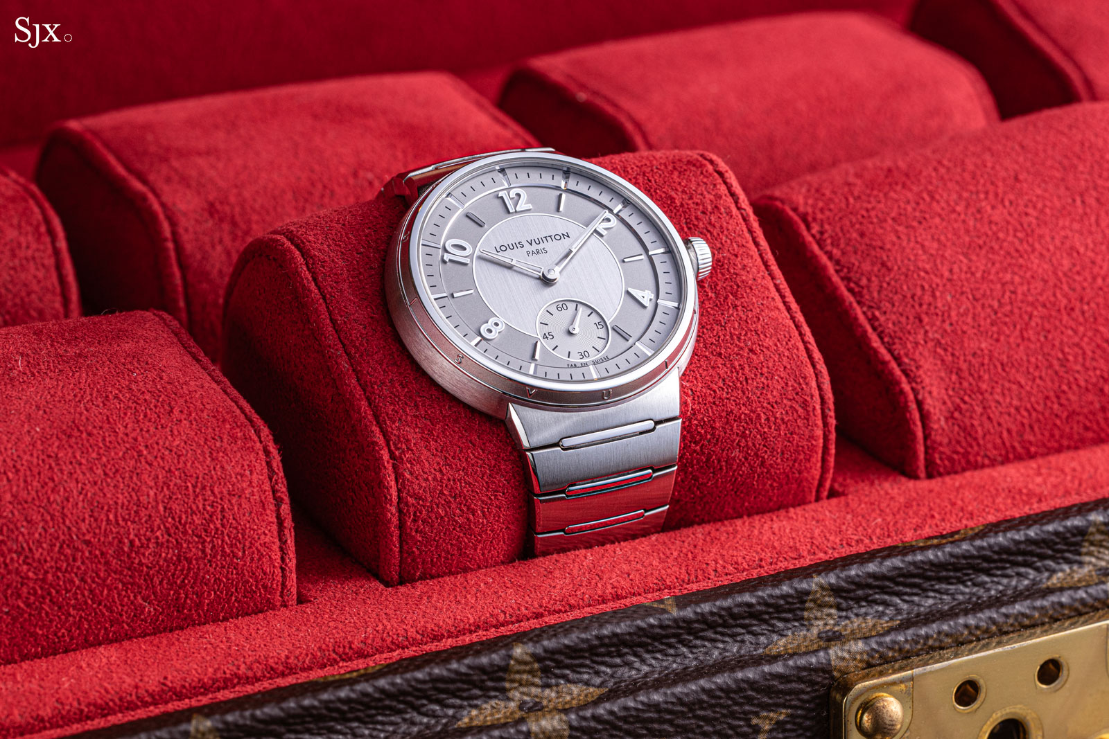
Because of its thinness, it feels entirely different from the original on the wrist. The bracelet integrates well into the case, which when combined with the brushed finish, also gives it a smooth, seamless feel.
In terms of details, the new Tambour is well done. The stepped dial, for instance, is attractive and sharply executed, while the case that forgoes a movement ring shows attention to detail.
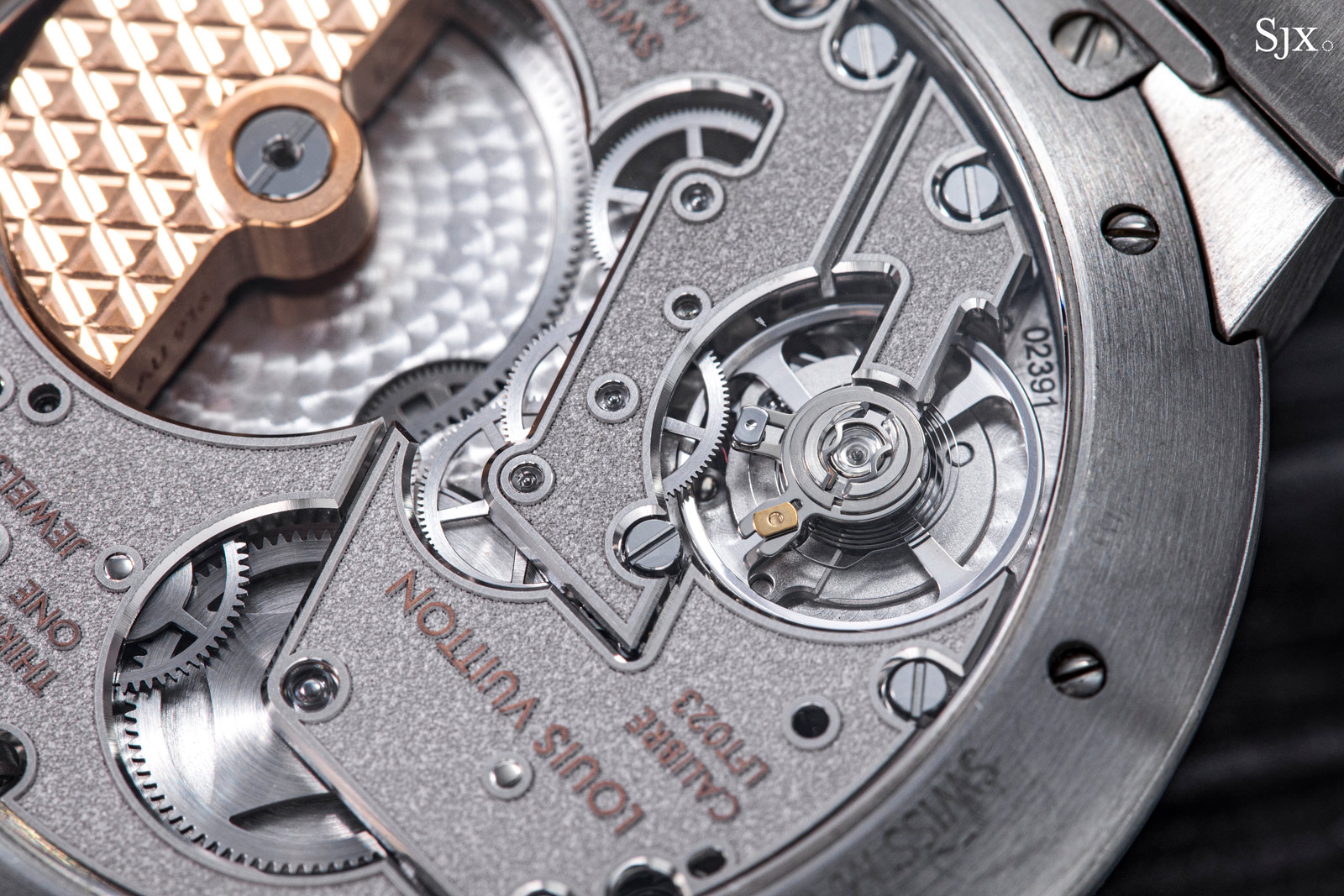
One detail, however, should have been improved. The movement has an Etachron regulator for the balance, perfectly serviceable but generally associated with less pricey watches. This isn’t uncommon in high-end watches – it can be found in Cartier skeleton movements as well – but a custom-designed regulator would complete the movement.
The new Tambour costs about US$20,000 in steel, which is a fair proposition. While Louis Vuitton watches often carry premium pricing simply because Louis Vuitton is the world’s biggest luxury brand, the new Tambour is fairly priced relative to the competition.
It costs the same as the H. Moser & Cie. Streamliner Centre Seconds and slightly more than the Bulgari Octo Finissimo. More notably, its priced similar to the Speake-Marin Ripples, which shares the same base calibre but is hindered by a less refined execution overall and a decidedly unappealing design.
Thinning the Tambour
While the new model is clearly descended from the Tambour of old, its streamlined design is vaguely 1970s and brings to mind the Porsche Design watches of that era that had similar integrated bracelets.
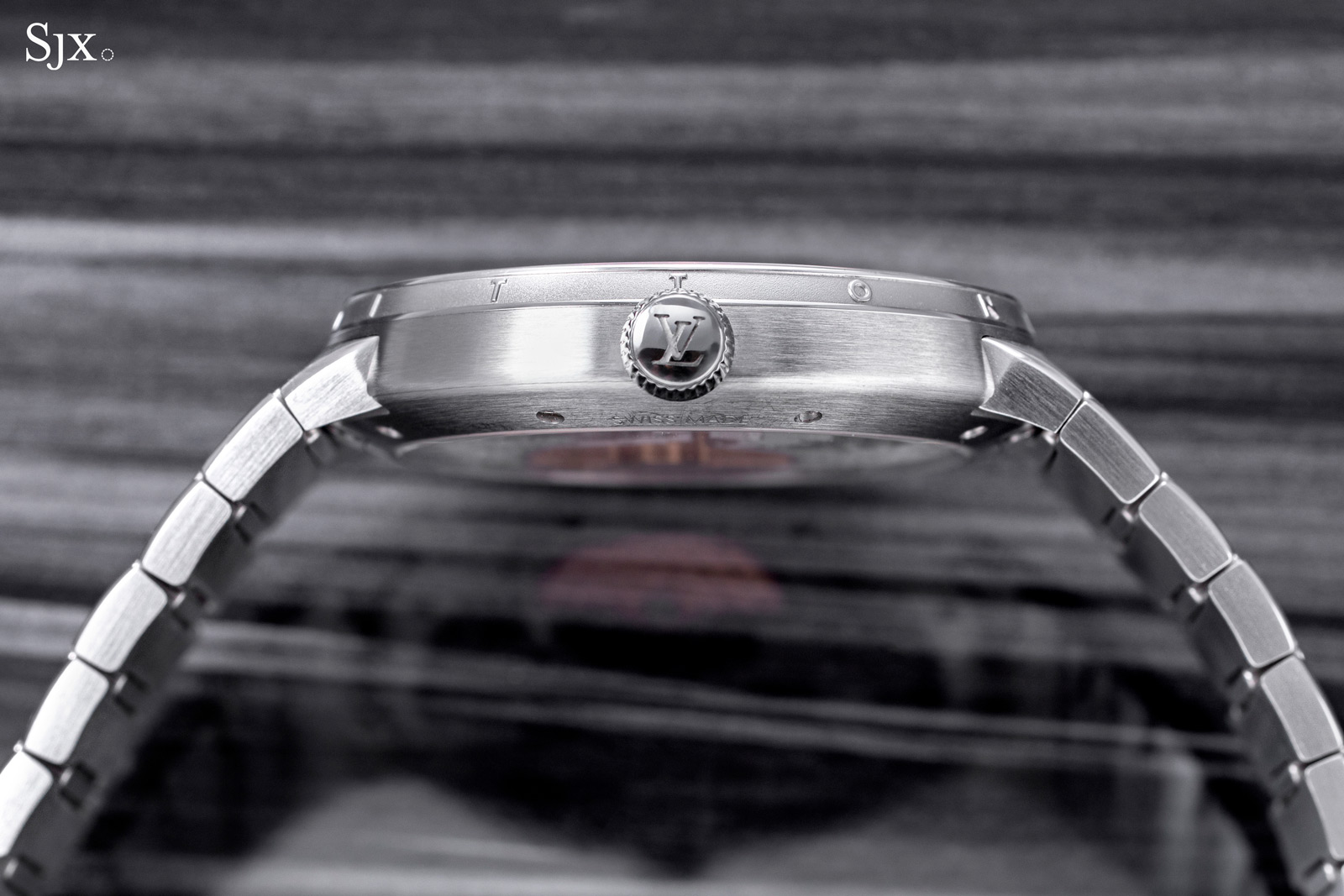
In the hand, the first impression is thinness. The watch is thin at 8.3 mm, but even knowing that it still feels thin. Needless to say, the slim proportions result in an elegant profile on the wrist.
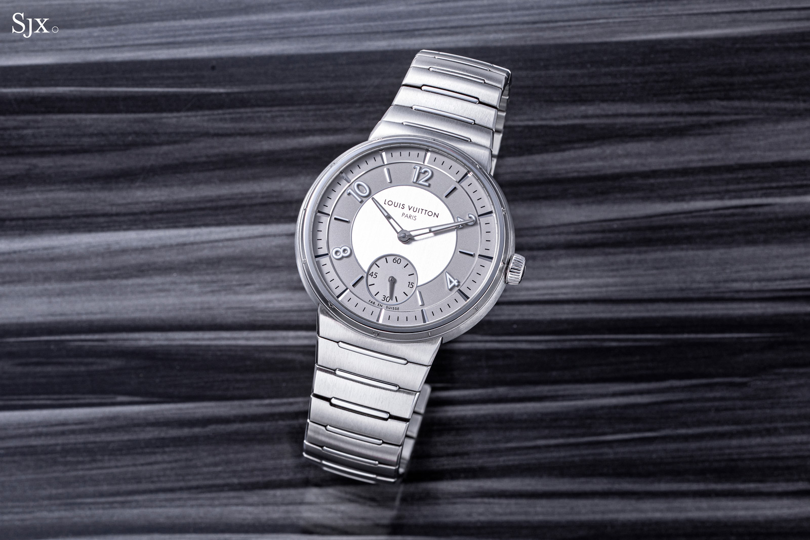
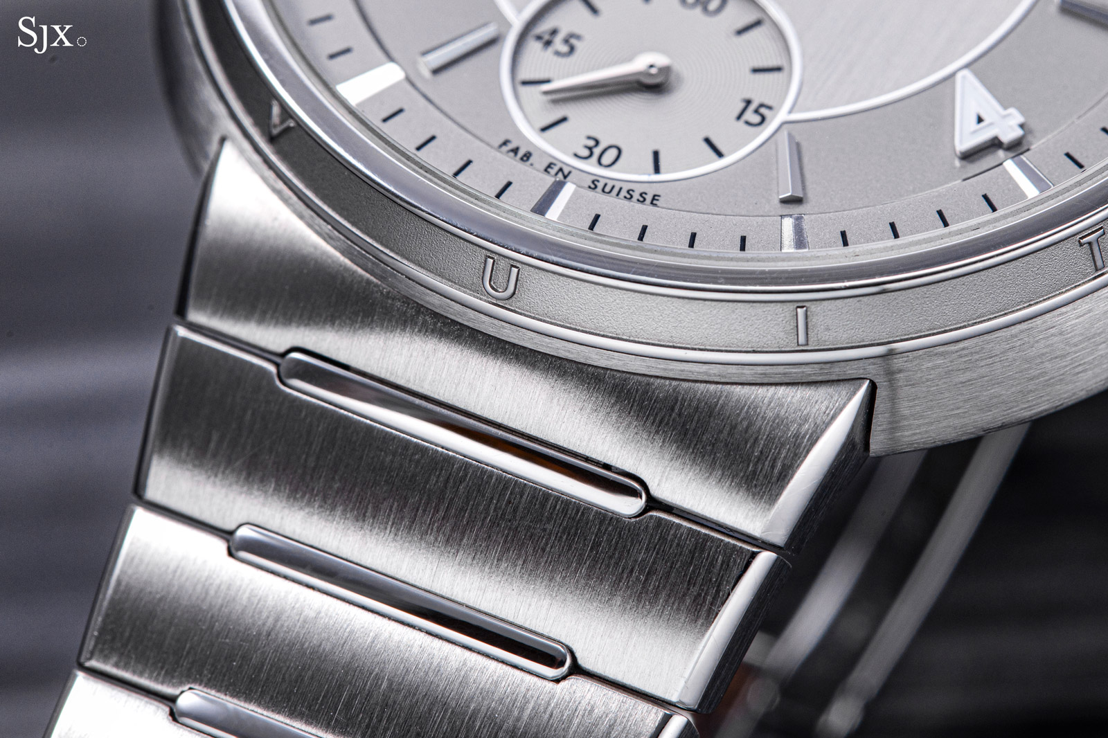
Despite sharing the same name as its predecessor, the 2023 Tambour is entirely different. It feels compact and refined, primarily due to the flat case but also because of the thin, tapered bracelet.
Its refined proportions and streamlined form are most obvious when compared against the Tambour Street Diver, which retains the chunky dimensions of the original design.
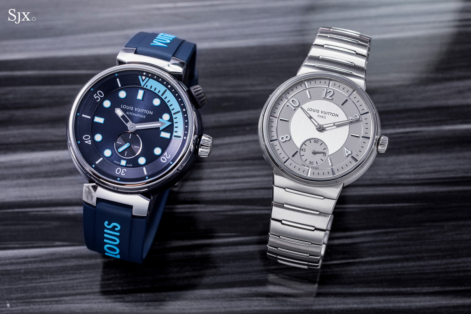
The 44 mm Street Diver (left) and the 40 mm Tambour
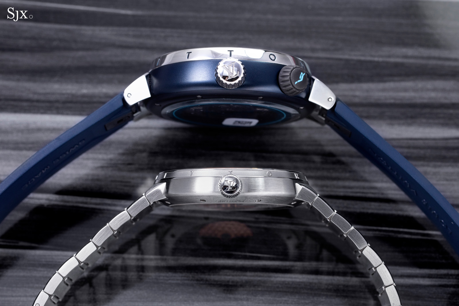
And the size is more obvious in profile, with the Street Diver at 12.8 mm compared to the 8.3 mm of the Tambour
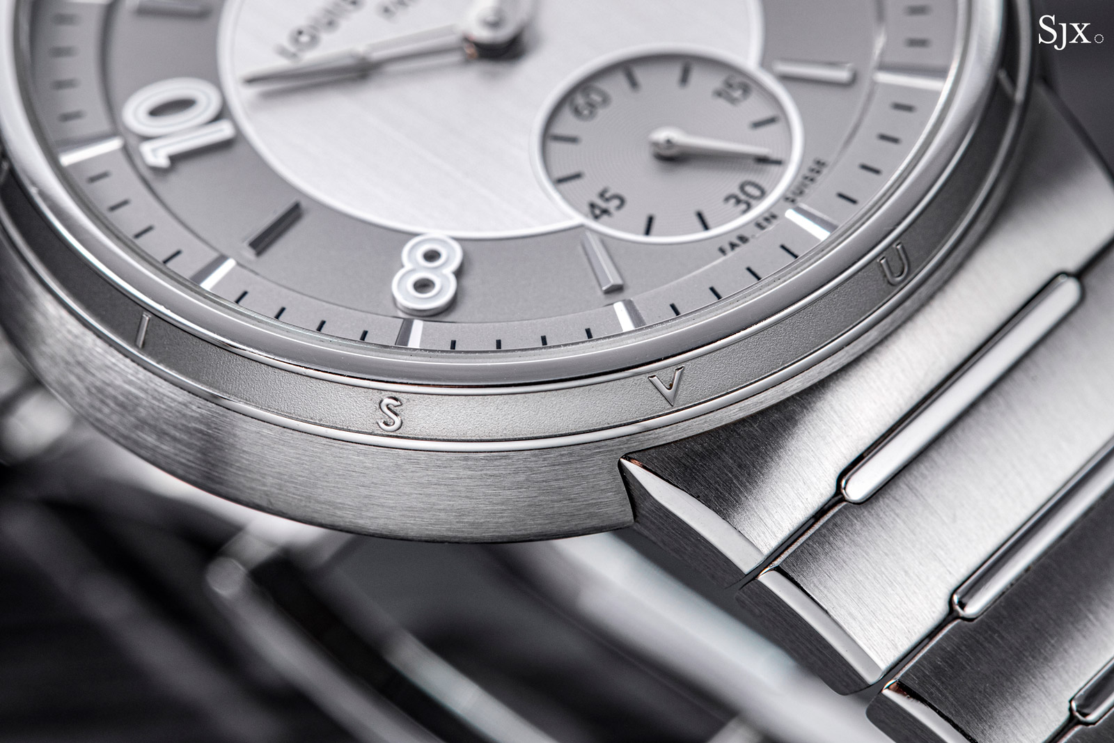
One element that contributes to the impression of thinness is the separate bezel. In contrast, the earlier generation Tambour was thicker but had no bezel.
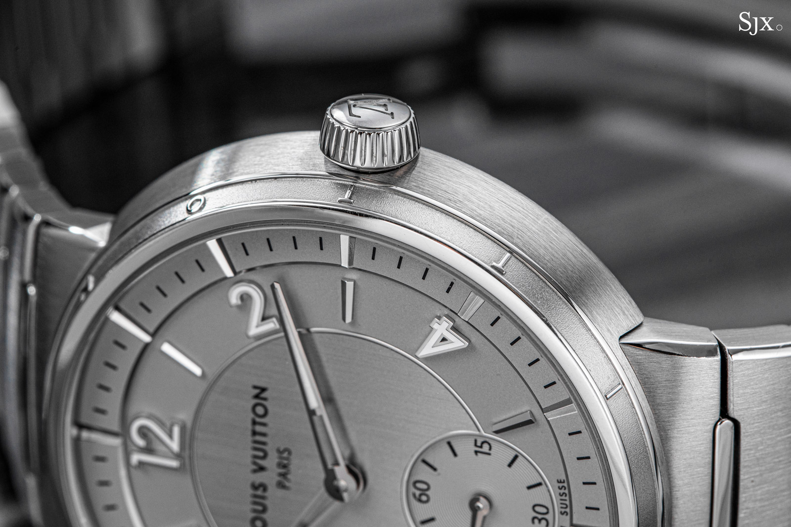
This flat and narrow bezel featuring the brand name in relief with raised, polished letters against a frosted surface. The font size is small, however, so the branding is not apparent when the watch is on the wrist.
Another key detail that adds to the perceived slimness is the domed back that helps conceal some of the height.
The case is almost entirely brushed, save for polished accents on the bracelet and bezel that are just enough to be slightly reflective while maintaining the overall low-key look. As it is with the movement, the case finishing is comparable to another similarly-priced sports watch, the Moser Streamliner.
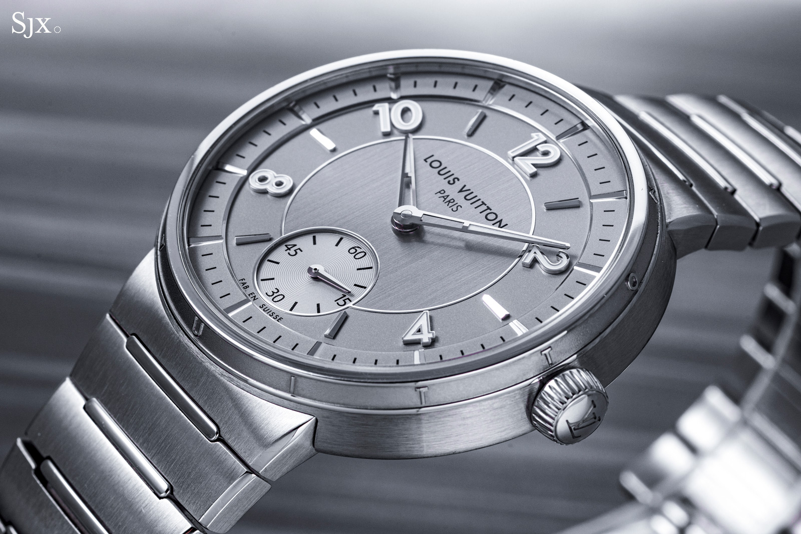
The bracelet flows into the case and tapers towards the bracelet, which gives the watch its sleek appearance. Notably, the taper is achieved by arching each link inwards towards the clasp, creating an elegant line from watch to clasp.
Like the case, the bracelet is mostly brushed but complemented by polished accents, namely the chamfers on the edges and centre links. The design is simple but effective and pairs perfectly with the watch.
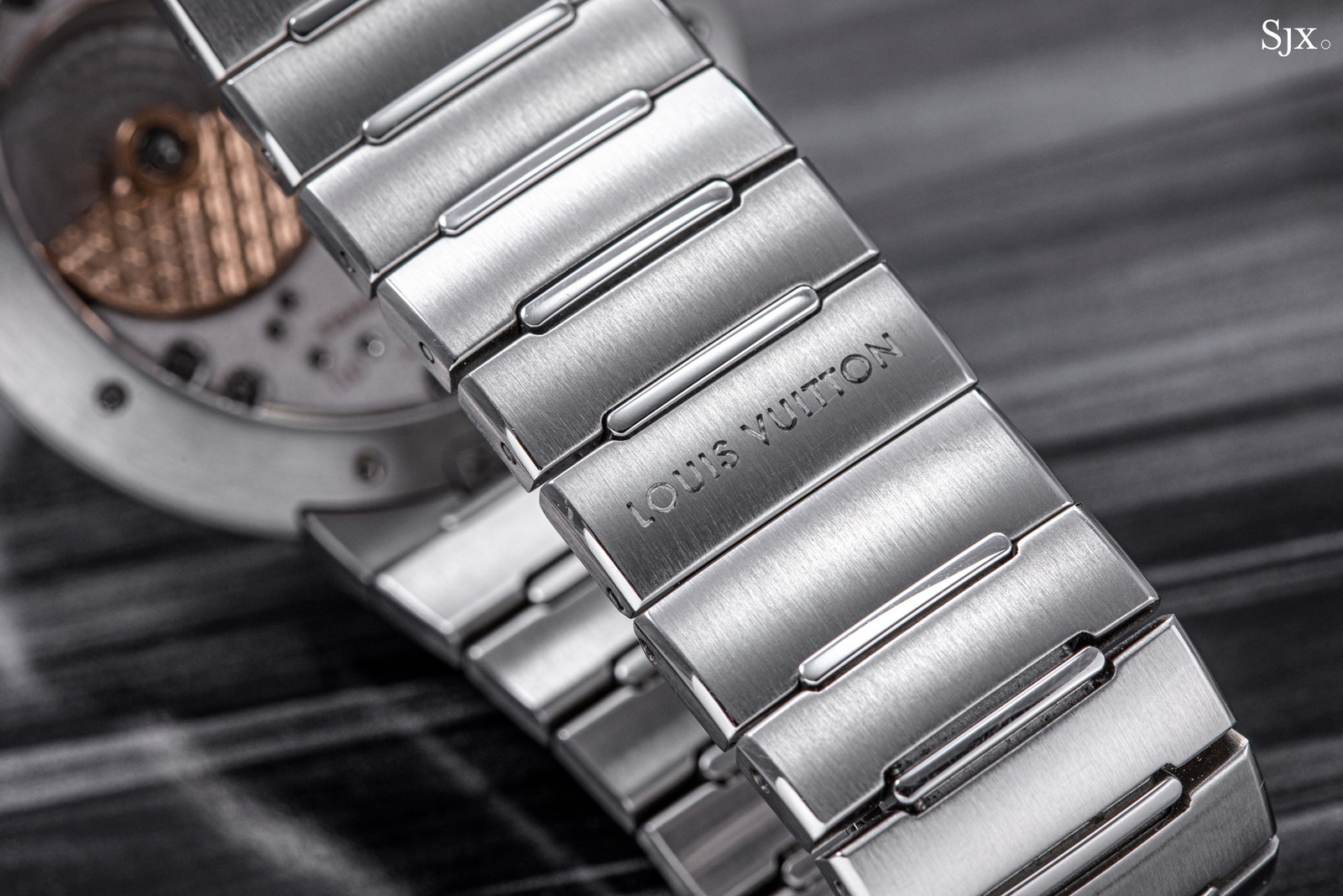
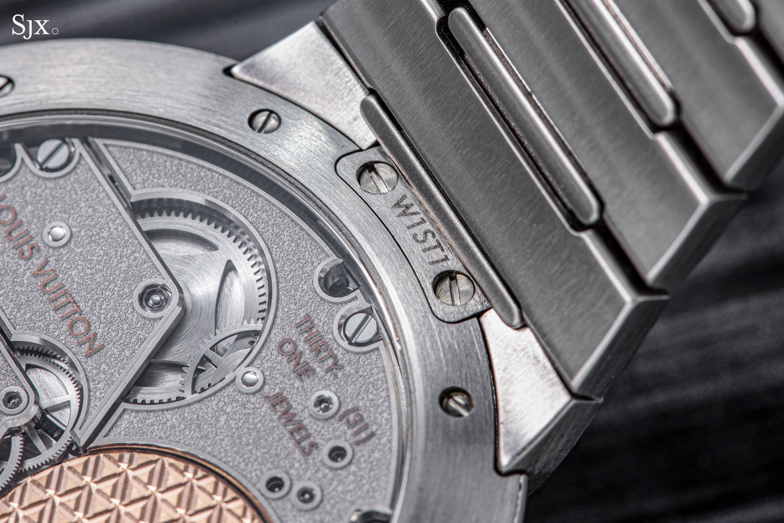
The bracelet is secured to the case middle with screws and cannot be replaced with a leather strap, making this a true integrated bracelet. This probably contributes to the coherence of the design, because constructing the case to easily accommodate both a strap and bracelet would probably have taken away from the streamlined look.
A final detail worth mentioning is the lack of the movement ring inside the case. Granted, this is invisible and doesn’t offer any functional advantage, but it certainly looks better when the case back is removed.
A modern sector
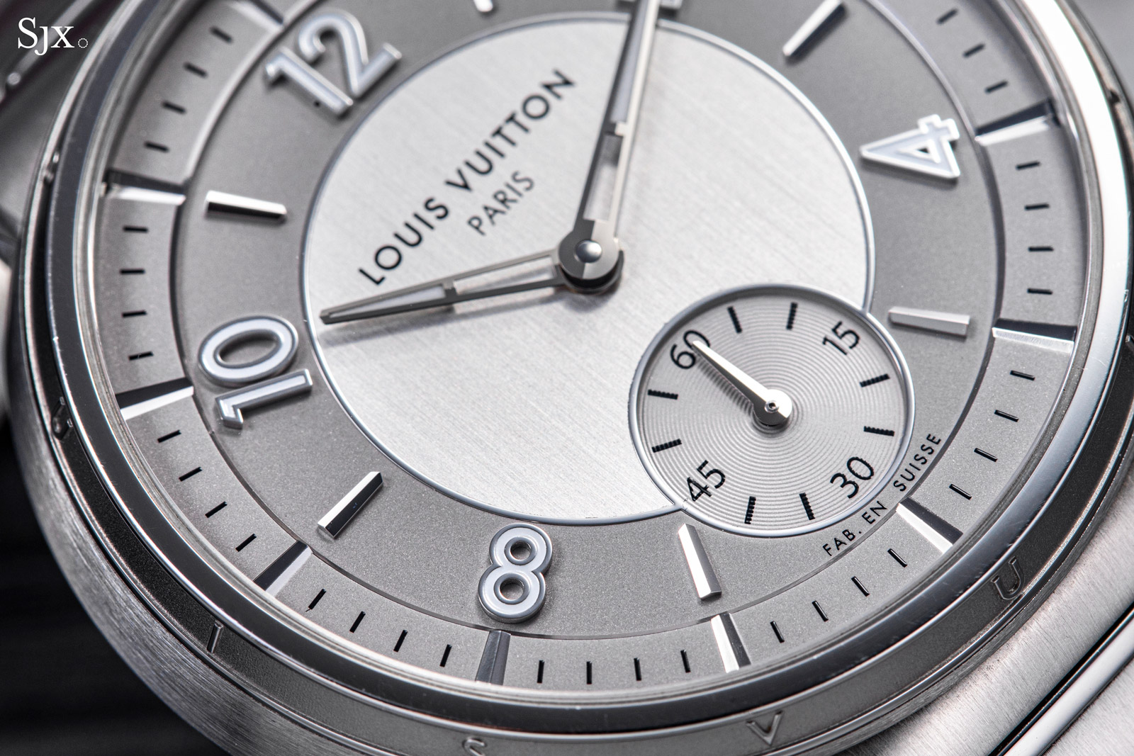
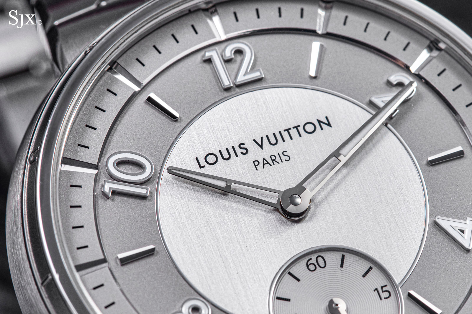
The Tambour dial is modelled on the dials found in the first-generation Tambour models, but tweaked for depth and detail. The result is a dial that doesn’t look fancy at a distance, but offers interesting details up close.
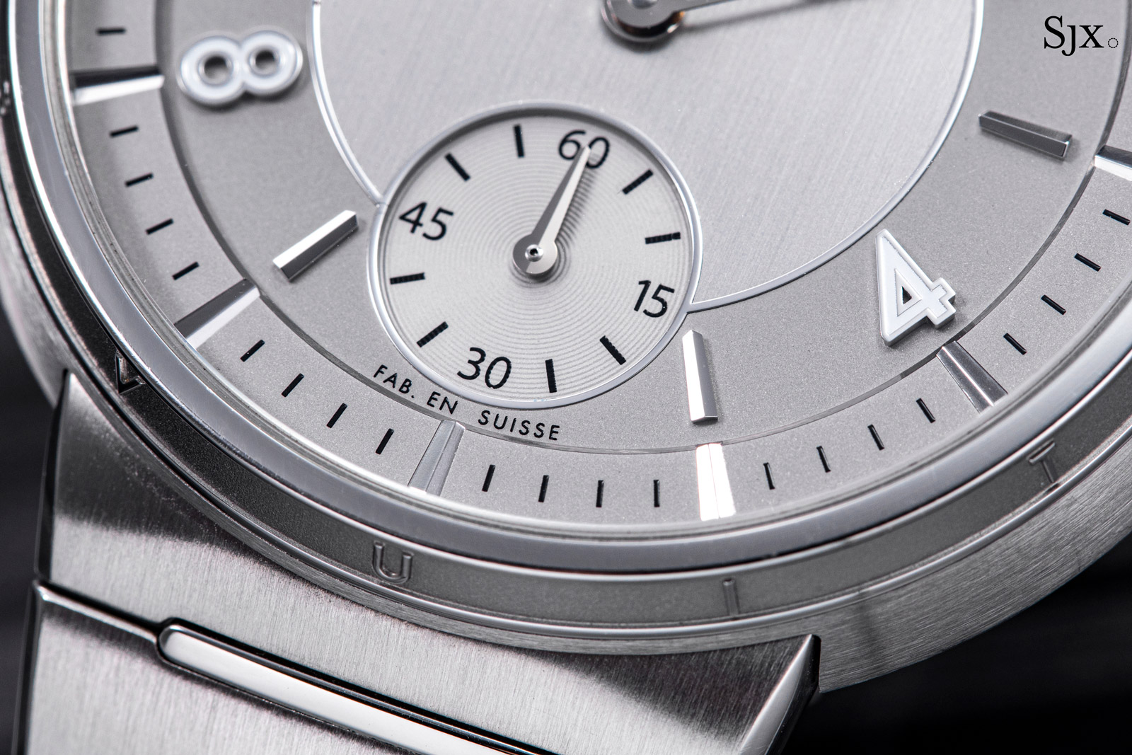
I like the design of the dial, though I would have preferred a seconds register without numerals. And I am undecided on the polished borders around each section of the dial; it might look cleaner without them and echo the silhouette of the case better.
The dial is essentially three levels – an outer minute track, central portion, and recessed seconds – each finished differently. The centre, for instance, is vertically brushed, while the chapter rings for the hours and minutes are frosted.
The varied surface finishing means each section catches the light differently, creating visual interest despite the monochromatic palette.
The minute ring is probably the most prominent element of the dial thanks to its unusual execution. It is raised above the rest of the dial and mirrors the hour markers with wide cutouts every five minutes.
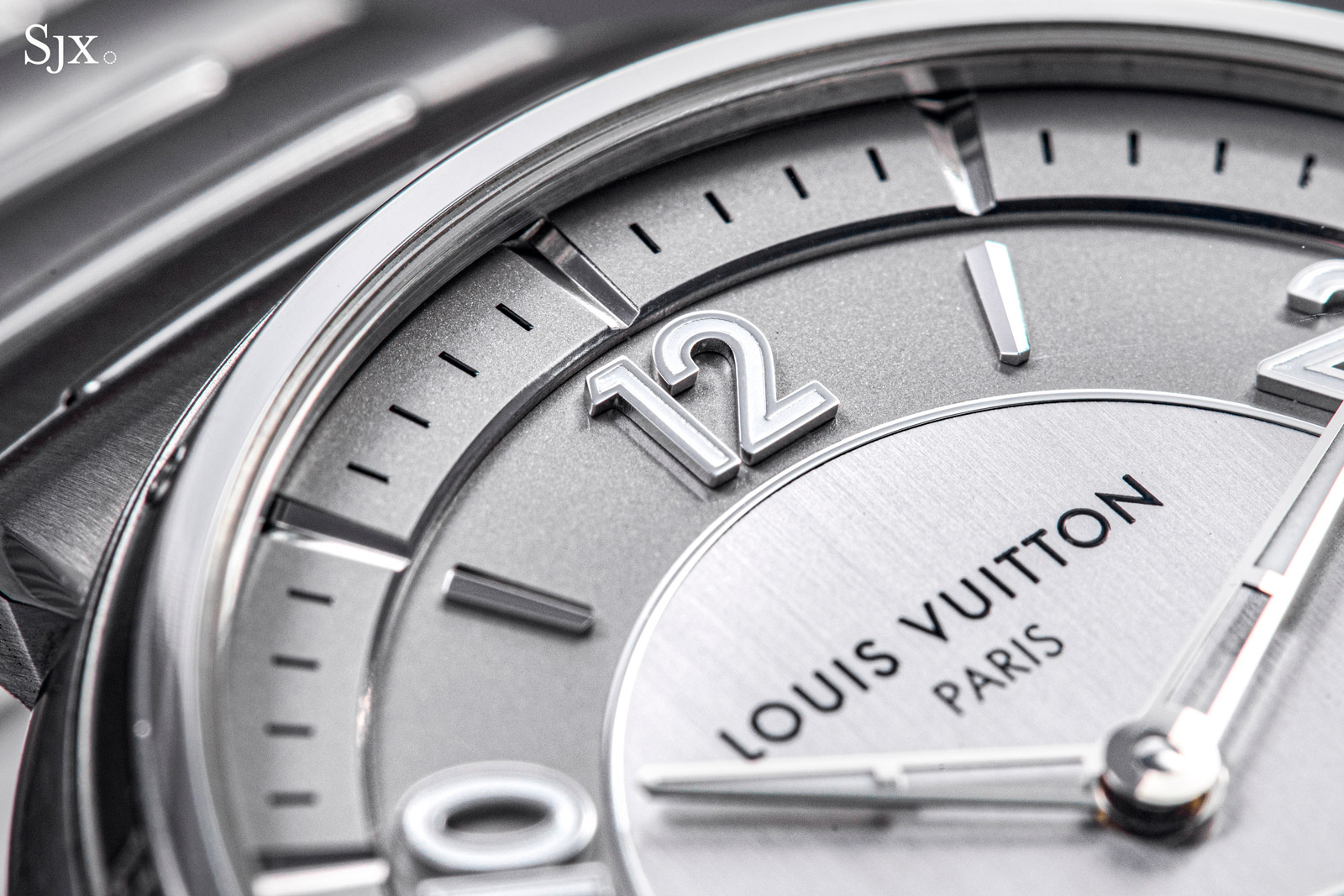
Both the chamfered inner edge of the minute ring as well as its cutout markers are done by CNC milling
As is increasingly the norm for high-end dials, the hands and applied markers are solid 18k white gold. But perhaps more interesting for collectors is the phrase at six o’clock. Instead of the conventional “Swiss made”, the dial reads “Fab. en Suisse”, both a reference to vintage watches (particularly those exported to France) as well as to La Fabrique du Temps.
Micro-rotor mechanics
Like the open-worked calibre in the recent Voyager Skeleton, the LFT023 was developed in collaboration with Le Cercle des Horlogers, a movement specialist that shares the same owner as Speake-Marin. Unsurprisingly, the LFT023 has the same basic architecture as many of Speak-Marin’s movements, though it is executed entirely differently in terms of finishing and design.
The LFT023 is both distinctive and appealing in terms of aesthetics. According to a Louis Vuitton representative, the LFT023 indicates where the brand is heading in terms of movement design.
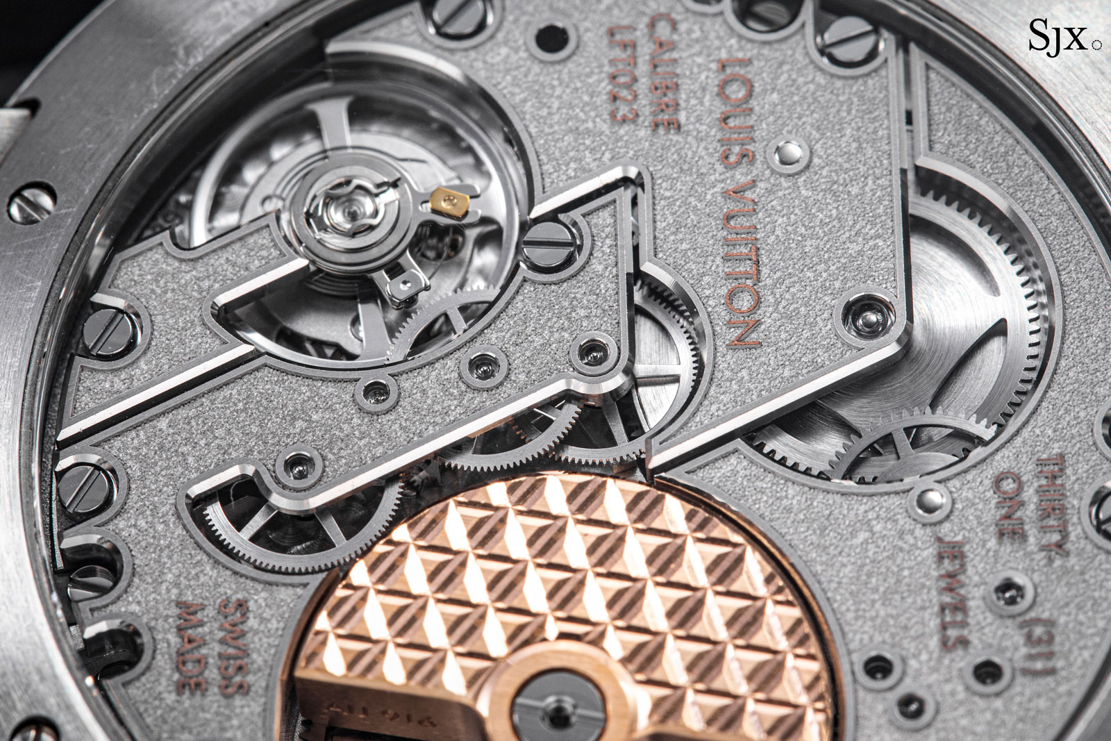
The movement is almost monochromatic – even the jewels are clear and colourless – save for a handful of rose gold elements. It’s a low-key style that reflects the restrained design of the watch, and one that diverts from the usual monogram-heavy look of the brand.
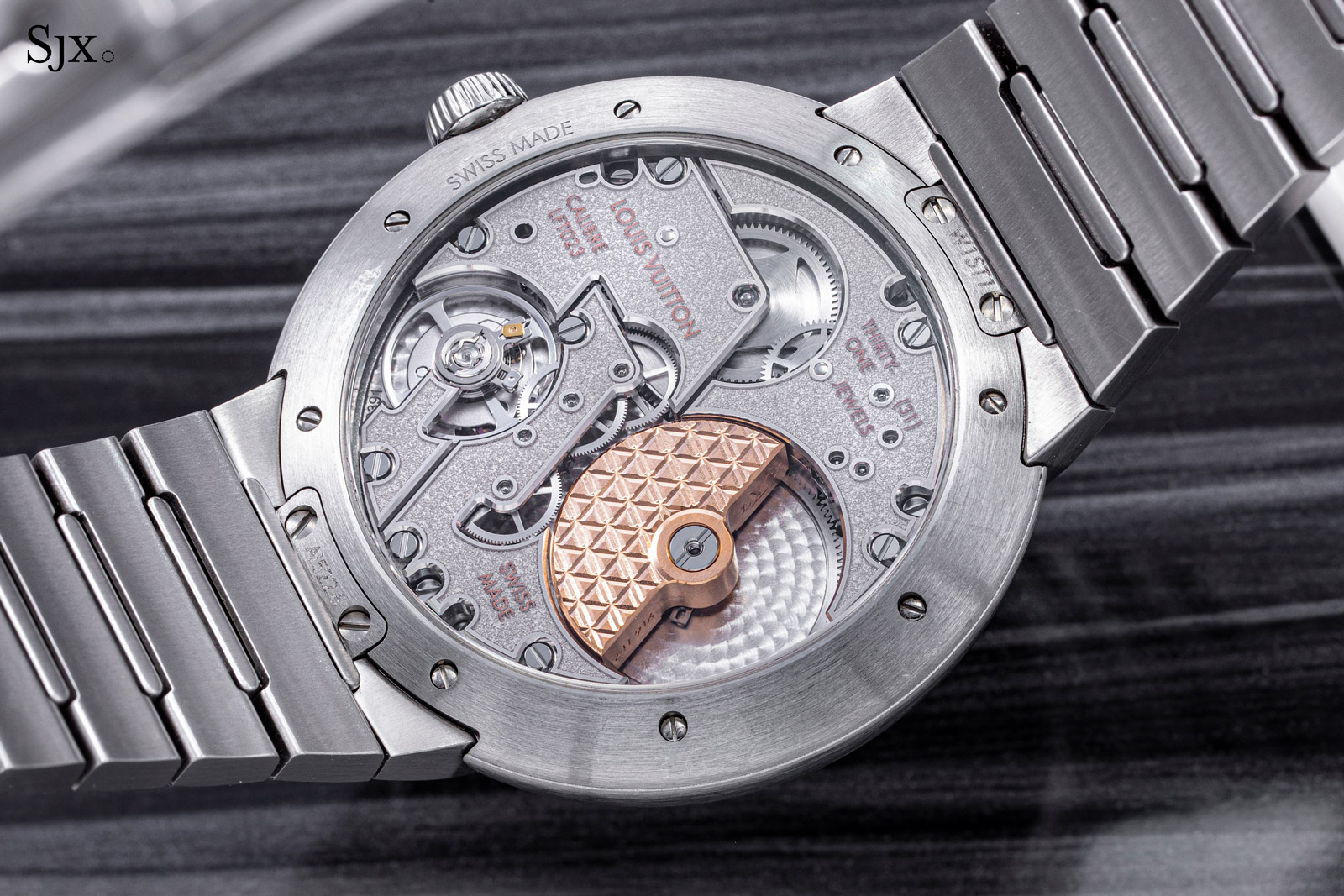
The bridges are uniformly finished with a granular texture enclosed by raised borders and accented with rose gold-plated relief lettering. The relief borders on the bridges are reminiscent of some Romain Gauthier movements, which is not a bad thing.
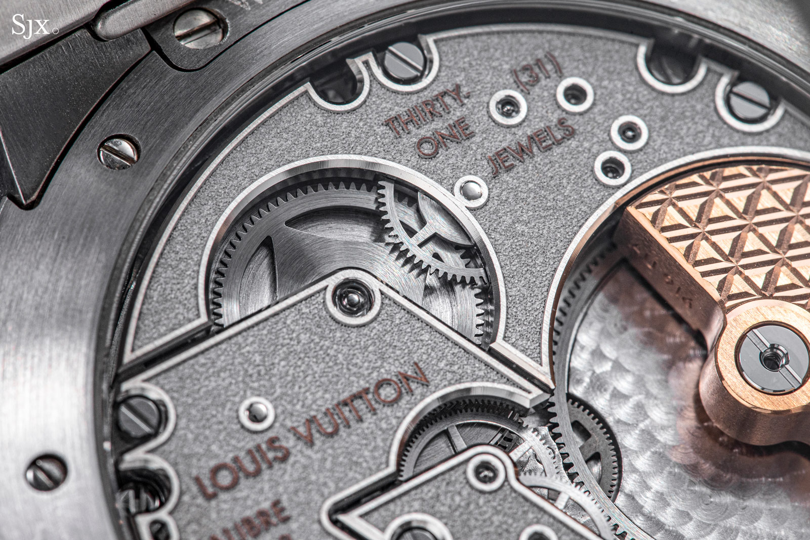
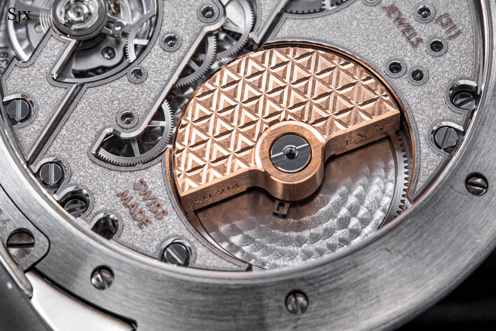
The rotor is solid 22k rose gold and finished with an engraved “V” motif
As is the case for majority of sports watches in this price range, the movement decoration is neat and mostly industrially applied. It’s comparable to the finishing in Cartier or Moser movements, but has the advantage of being different and recognisable – without resorting to applying “LVLVLV” all over.
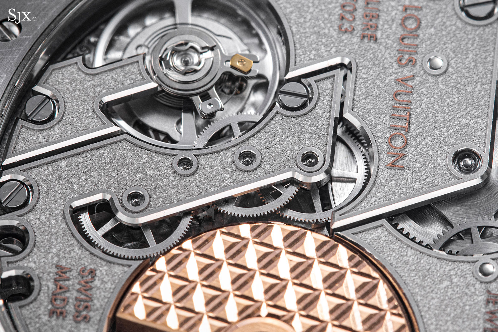
But the technical-minded enthusiast will spot the Etachron regulator that feels out of place. This is the only element I would change and certainly one that will complete the movement in terms of visual appeal.
Concluding thoughts
The new Tambour is done well. In tactile terms the design succeeds because it wears well and feels good. At the same time, the movement is attractive and executed correctly (except for the regulator). Importantly, it’s priced right. The new chapter for Louis Vuitton watchmaker is going in the right direction.
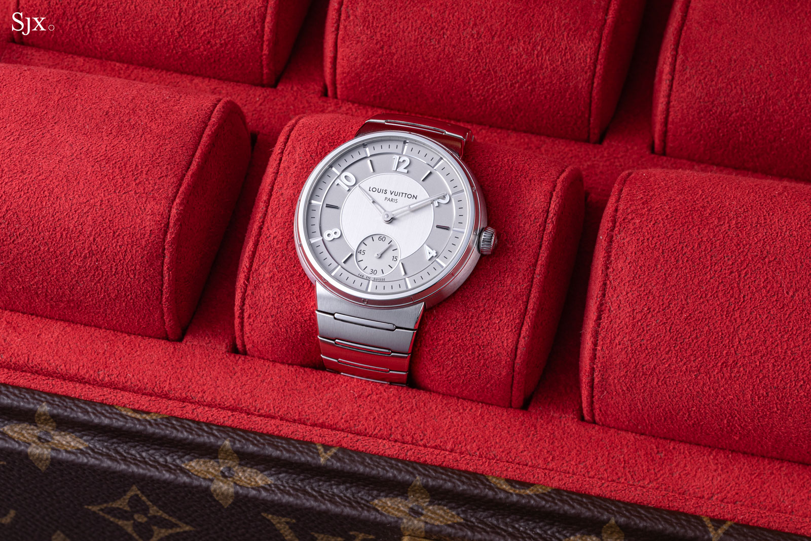
Key facts and price
Louis Vuitton Tambour
Ref. W1ST10 (steel with silver dial)
Ref. W1ST20 (steel with blue dial)
Diameter: 40 mm
Height: 8.3 mm
Material: Steel
Crystal: Sapphire
Water resistance: 50 m
Movement: LFT023
Features: Hours, minutes, and seconds
Frequency: 28,800 beats per hour (4 Hz)
Winding: Automatic
Power reserve: 50 hours
Strap: Steel bracelet
Limited edition: No
Availability: At Louis Vuitton boutiques
Price: €19,500 including 20% VAT
For more, visit Louisvuitton.com.


