In this weekly market report, we look at the various asset classes, industries, equity categories, and exchange-traded funds (ETFs) that moved the market higher and the market segments that defied the trend by moving lower.
Identifying the winners and losers allows us to see the direction of significant financial flows and their origin. Indications of widening market participation are showing up in the data. As this pattern persists, the sustainability of the bull market will steadily improve.
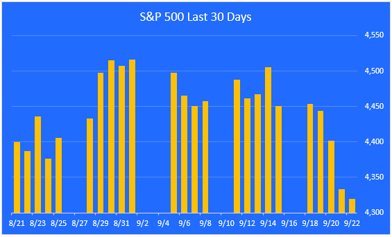
The S&P 500 pullback continues.
For the week, the S&P 500 was down 2.9%. We are now 5.9% below the 2023 high water mark, set on July 31. The market is still in the process of digesting its gains and broadening its participation.
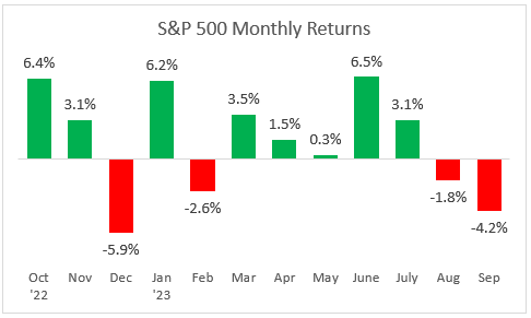
A look at monthly returns.
This chart shows the monthly returns for the past year. September is off to a negative start, and history shows that September is the weakest month of the year, on average.
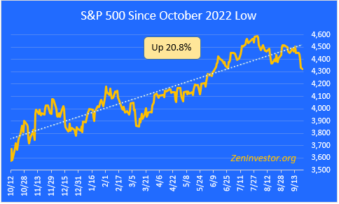
The bull market slips further below the trend line.
This chart highlights the 20.8% gain in the S&P 500 from the October 2022 low through Friday’s close. The index is now 9.9% below its record high close on January 3, 2022.
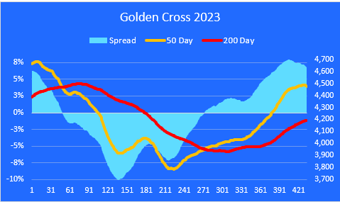
The Golden Cross.
The market entered a Golden Cross configuration (a Golden Cross occurs when the 50 day moving average crosses above the 200 day) on February 2, 2023.
The spread between these two moving averages is beginning to narrow. Today it stands at 6.8%, nearly three times as wide as the long term average of 2.3%. This wide spread is one of the reasons I’m expecting the current pullback to continue.
Worth mentioning is the fact that the 50 day line is now pointing nose down, which is further evidence of the loss of upward momentum.
Major asset class performance.
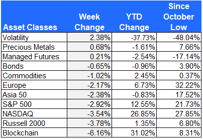
Here is a look at the performance of the major asset classes, sorted by last week’s returns. I also included the year-to-date returns as well as the returns since the October 12, 2022 low for additional context.
The best performer last week was Volatility, as investors were willing to pay higher premiums to hedge their downside risk.
The worst performing asset class last week was Blockchain. A strengthening U.S. dollar and increasing regulatory pressure are adding to the week’s crypto market underperformance.
Equity sector performance
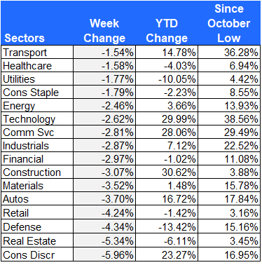
For this report I use the expanded sectors as published by Zacks. They use 16 sectors rather than the standard 11. This gives us added granularity as we survey the winners and losers.
Transportation and Healthcare stocks held up the best last week, while defensive sectors like Utilities and Consumer Staples also outperformed.
Consumer Discretionary and Real Estate were hardest hit, as higher rates begin to bite and summer vacations wind down.
Equity group performance
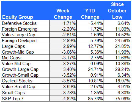
For the groups, I separate the stocks in the S&P 1500 Composite Index by shared characteristics like growth, value, size, cyclical, defensive, and domestic vs. foreign.
Defensive stocks held up better than the rest of the equity groups on the list.
The worst performing group was the S&P Top 7 mega-cap tech stocks.
The S&P Top 7
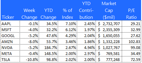
Here is a look at the seven mega-cap stocks that have been leading the market all year. Tesla was the biggest loser, down 10.8% for the week. Apple, the strongest of the group, only gave up 0.1%.
These seven stocks account for 79% of the total YTD gain in the S&P 500. That’s down from 82% just two months ago, providing evidence that participation in the bull market is broadening out.
The 10 best performing ETFs from last week
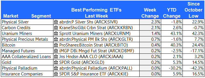
Five of the top ten ETFs last week were from the metals & mining industry. Silver, Gold, Palladium, Uranium Miners and Physical Precious Metals all outperformed the broad market.
The 10 worst performing ETFs from last week
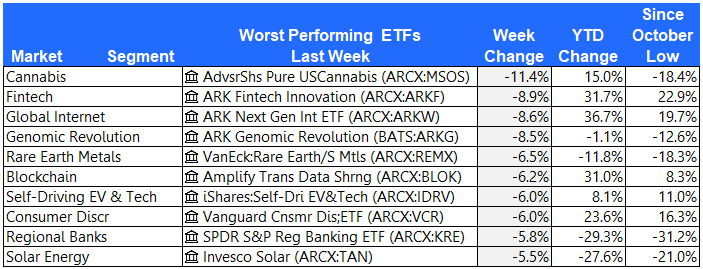
After three weeks atop the leader board, Cannabis stocks gave back some of their gains. The high beta, high valuation ARK funds also stumbled last week.
The 10 best performing stocks from last week
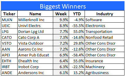
Here are the 10 best performing stocks in the S&P 1500 last week.
Millerknoll Inc. will report earnings next Tuesday. Rumor has it that they will beat their numbers and provide upbeat guidance going forward.
The 10 worst performing stocks from last week
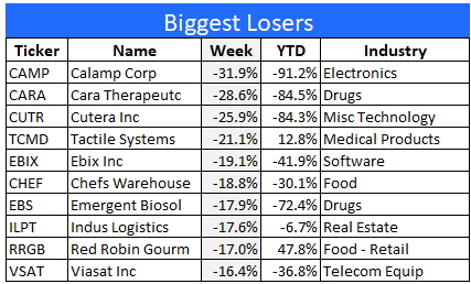
Here are the 10 worst performing stocks in the S&P 1500 last week.
Calamp, a penny stock, is down 91% year-to-date. Survival is not assured. Buyers beware.
Final thoughts
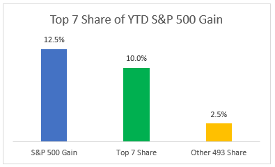
Despite the broadening of participation we’ve been seeing lately, the S&P Top 7 stocks continue to dominate the market. As the following chart shows, these seven mega-cap tech stocks account for 80% of the S&P 500 YTD gain.
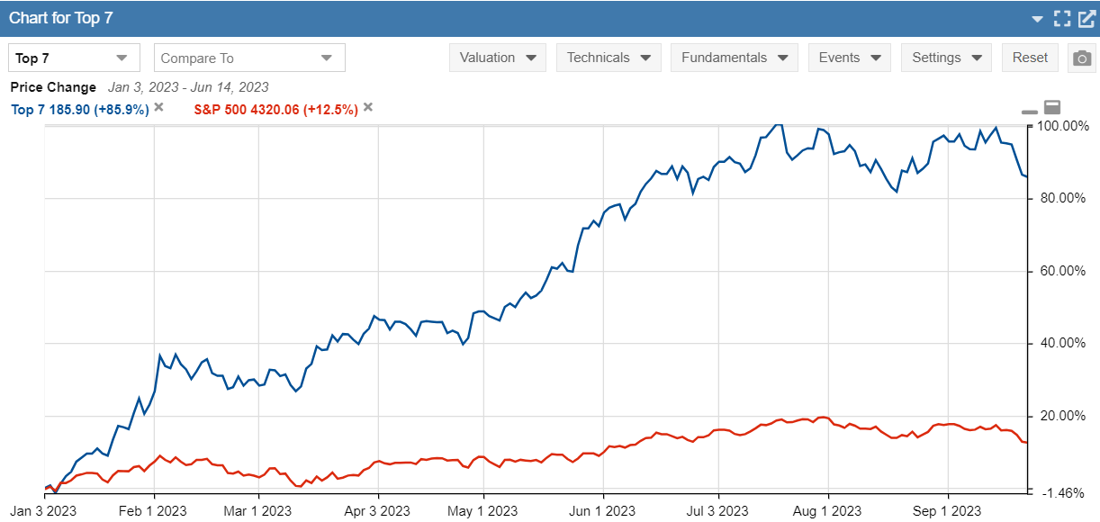
A hypothetical portfolio comprised of these seven stocks, weighted equally, would be up by 85.9% YTD, vs. 12.5% for the S&P 500. The next chart bears this out.
Since the recent market peak on July 31, the S&P 500 is down 5.9% and the Top 7 cohort is down by 6.6%. This tells me that the Top 7 stocks are leading the market lower but they have not “rolled over,” at least not yet. What we’re seeing instead is a mild, orderly pullback that has broad participation. Put another way, it looks like investors are trimming back their exposure to a broad range of equities, rather than focusing on the more expensive market leaders.
As this pullback continues to play out, I will continue pay close attention to what’s happening with the Top 7. For now, at least, they still call the tune.
The post The 1-Minute Market Report September 25, 2023 appeared first on Zen Investor.


