 When investing in bonds, one of the decisions is how long you want the “term to maturity”, or how much longer the bond will pay interest and then upon maturity repay the principal. The longer the term, the more sensitive the bond price is to interest rates. They are usually broken up into short-term, intermediate-term, and long-term categories. iShares manages a set of popular ETFs that invests in US Treasury bonds of certain maturities:
- iShares 1-3 Year Treasury Bond ETF (SHY)
- iShares 7-10 Year Treasury Bond ETF (IEF)
- iShares 20+ Year Treasury Bond ETF (TLT)
Historically, the longer the term, the higher the return. In exchange for this potential higher return, the longer term leaves you expose to higher interest rate risk. A recent “Chart of the Day” from Abnormal Returns compared the drawdowns of short-term (SHY), intermediate-term (IEF), and long-term (TLT) Treasuries over the last 20 years. I found it a very good visualization of the greater interest rate risk of longer-term bonds in terms of a dropping balance in your brokerage account.
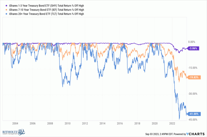
Right now, you might look at this chart and question why anyone would have wanted to own long-term Treasury bonds if you could experience a drawdown of 41%! And from “100% safe government bonds” no less! 😡
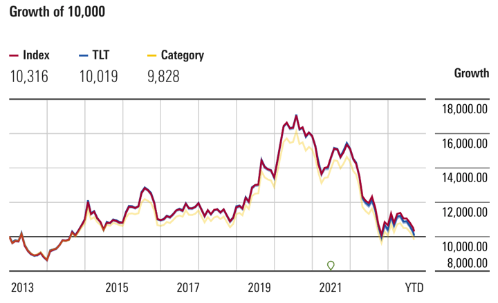
Well, lots of people were quite happy with their long-term bonds up until recently. Here is a Morningstar chart that tracks the growth of $10,000 first invested 10 years ago (2013) in the long-term Treasury ETF TLT. During the initial COVID response, your $10,000 investment would have been worth nearly $17,000 when interest rates were dropping. But as of today, you are basically back to only $10,000 again after a long 10 years.
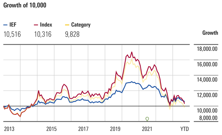
The Growth of 10k chart for the intermediate-term Treasury ETF IEF is similar, but a bit downsized. The peak value in 2020 was about $13,000 before coming back to close to $10,000 again as well. (Focus on blue line only.)
Finally, the Growth of 10k chart for the short-term Treasury ETF SHY was much more ho-hum. Notice how the vertical axes increase in much smaller increments. The peak value in 2020 was only about $11,000 before ending just slightly lower at ~$10,700. (Focus on blue line only.)
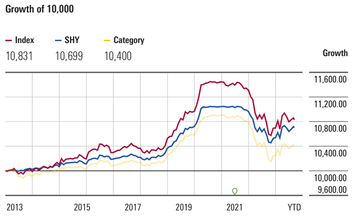
In fact, if you compare all three ETFs, the short-term ETF SHY had the highest ending value (and highest total return) over the last 10 years. Term risk showed up, and you could have had both a calm ride and more money in the end.
This is not a recommendation to only buy short-term bonds. Interest rates have been rising recently at one of the fastest rates in history, and that may stop or reverse at any time. Many people still choose to purchase longer-term Treasury bonds as a protection against deflation and/or dropping interest rates. Mostly, these charts help illustrate how these different types of bond terms respond to volatile interest rates. You may wish for a quieter ride (and less downside potential), even if you give up some upside potential. Or not.
“The editorial content here is not provided by any of the companies mentioned, and has not been reviewed, approved or otherwise endorsed by any of these entities. Opinions expressed here are the author’s alone. This email may contain links through which we are compensated when you click on or are approved for offers.”
Bond Drawdown and Growth Comparison Charts: Short vs. Intermediate vs. Long-Term Bonds from My Money Blog.
Copyright © 2004-2022 MyMoneyBlog.com. All Rights Reserved. Do not re-syndicate without permission.
